
Table of Contents
The web has changed. A decade ago, a static website with a contact form was enough to keep a business looking modern. A static website is essentially a digital brochure, where the content stays the same for every visitor, and the only real action they can take is reading the text, looking at a few images, and perhaps filling out a basic form.
Today, visitors expect more than just a company and its products or details on a website. These websites respond to their clicks, forecast their questions through their purchasing behaviour, and adjust to whatever device they happen to be holding. This shift is why so many brands now invest in website design and development services that go beyond aesthetics and focus on engagement.
Building an interactive website is not just about adding flashy animations or pop-up chat windows. It is about creating an experience that feels alive, useful, and worth coming back to. This guide walks through the entire process and shows how a thoughtful approach can turn casual browsers into loyal users.
What Exactly Is an Interactive Website?
An interactive website is one that responds to visitors in meaningful ways. Instead of presenting information in a one-way broadcast, it invites people to participate in a conversation that sparks curiosity.
That participation can take many shapes. For example:
- A calculator that shows mortgage estimates as numbers are typed
- A product configurator that previews colours in real time
- A quiz that recommends a skincare routine
- A simple chatbot that points users to the right service page.
The common thread in an interactive website is its responsiveness factor—the way the site listens, processes, and responds. This back-and-forth makes the website visit feel personal for every customer. Also, the personalization in the website is what keeps people on a page longer, drives them deeper into the sales funnel, and eventually convinces them to convert.
Why Interactivity in Digital Space Matters More Than Ever
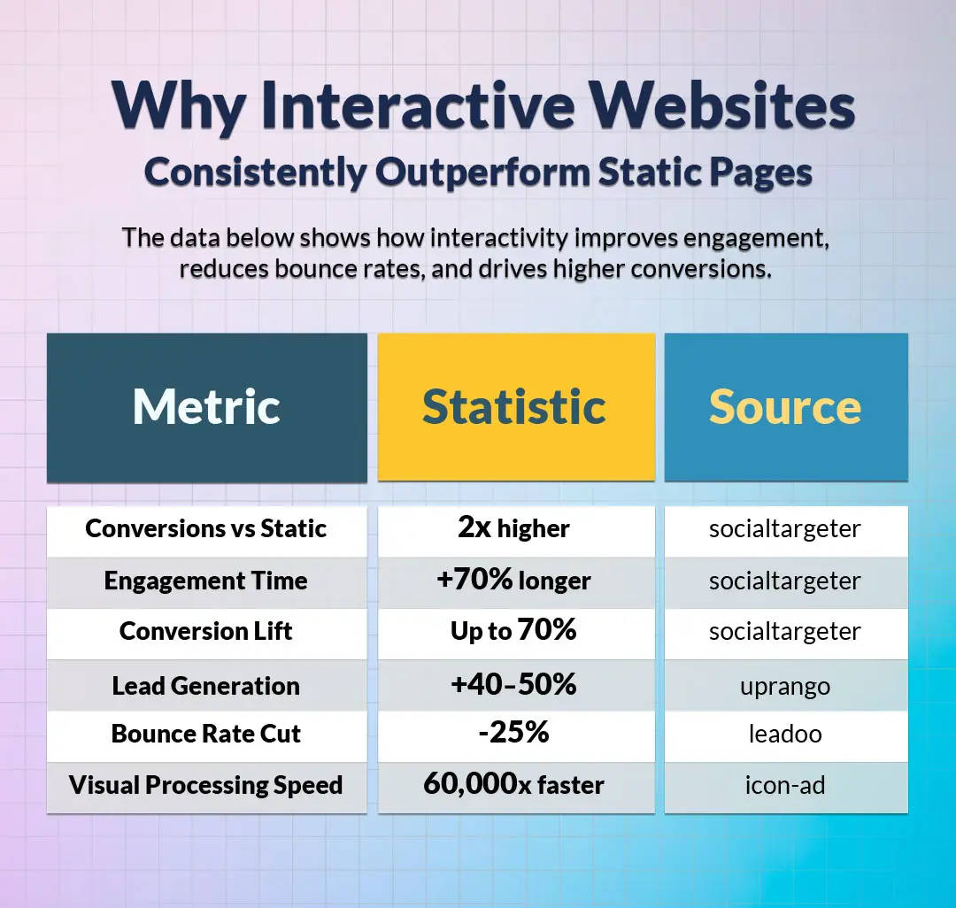
People scroll past static content on the web without noticing it. Attention is a scarce resource, and brands that fail to earn it within seconds lose the visitor for good. Interactivity grabs attention because the brain is wired to pay attention to anything that moves, changes, or responds. A subtle hover effect, a smooth scroll animation, or a clever micro-interaction can turn a forgettable page into one people remember and share.
There is also a business aspect to this. Interactive elements gather data on what visitors actually want, where they get stuck, and which features matter most. That information feeds back into smarter design choices, which, in turn, improve conversions.
A static brochure site can only guess at what its audience cares about, while an interactive one collects evidence with every click, scroll, and form submission. Over months, this evidence becomes a valuable asset, shaping not just the business’s website but its product decisions, marketing campaigns, and customer support strategies.
Understanding the Developing Process of Interactive Websites
Building an interactive website is rarely a single burst of activity but rather a sequence of connected stages, each one feeding into the next. Skipping or rushing any of these stages tends to show up later as broken features, frustrated users, or expensive rework. This is why understanding the full process from the start makes such a difference to the result.
Step 1: Define the Purpose of the Project
Every successful website design project begins with clarity. Before any colour palette is picked or any line of code is written, the team must answer one question: what should this website achieve?
The answer might be lead generation, online sales, community building, or simply educating an audience. Whatever it is, that goal becomes the lens through which every later decision is judged.
A discovery workshop is the usual starting point of developing an interactive website. Stakeholders sit down and discuss their audience, competitors, and the actions they want visitors to take.
Identifying the Target Audience
Knowing what the site is for helps define the purpose more clearly. A site aimed at retirees comparing insurance plans will look and behave very differently from one targeting Gen Z gamers.
Here, it is important to conduct useful research, including user personas, journey maps, and a study of how the audience currently solves the problem the site intends to address. Surveys, interviews, and a close look at competitor reviews often surface unmet needs that become the basis of standout features. The deeper the understanding of the visitor, the more relevant the interactivity will feel, and the less likely the project is to drift into building features nobody asked for.
Setting Measurable Goals
Vague ambitions like "more traffic" or "better engagement" are hard to act on. Specific targets work much better. Examples include cutting bounce rate by 20%, adding 500 newsletter subscribers per month, or pushing the average session length past three minutes. These numbers give the development team something concrete to design toward.
Step 2: Plan the Architecture and User Flow
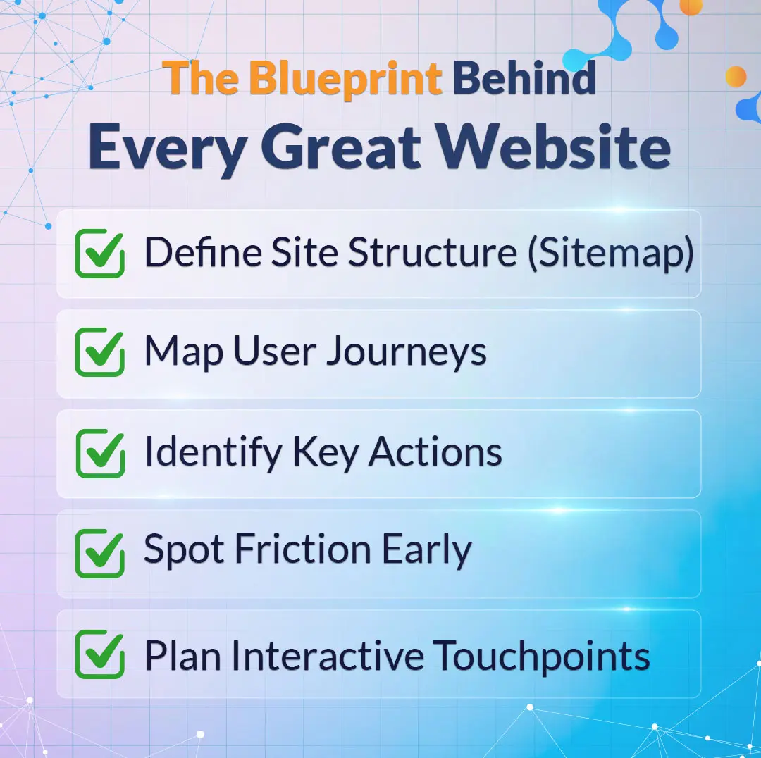
Once the purpose is clear, the next job is mapping out how visitors will move through the site. This stage is often overlooked, yet it is where most of the value is created. A logical structure makes content easy to find, while a confusing one drives people away, no matter how beautiful the design.
A sitemap lists every page and shows how they connect. Alongside it, user flow diagrams trace the path a visitor takes from landing on the homepage to completing a desired action. These diagrams highlight friction points before a single mock-up is drawn, saving weeks of rework later on.
Mapping Interactive Touchpoints
This is the moment to decide where interactivity will live. Will the homepage feature an animated hero section? Should the pricing page include a slider that adjusts based on team size? Does the blog need a progress bar for reading?
Marking these touchpoints early helps the design and development teams plan resources and avoid bolting features on as an afterthought.
Step 3: Wireframing and Prototyping
Wireframes are the blueprint of the site. They show layout, hierarchy, and placement without the distraction of colour or imagery. Tools like Figma, Sketch, and Adobe XD make it easy to share these blueprints with stakeholders and gather feedback quickly.
After wireframes come prototypes, which add a layer of clickability. A prototype lets stakeholders experience the flow as a visitor would, complete with transitions and basic interactions. Catching usability issues at this stage costs almost nothing. Catching them after launch can be expensive and embarrassing.
What Are the Five Golden Rules of a Website?
Website designers often refer to a set of guiding principles that keep projects on track. The five golden rules most professionals follow are:
- Clarity of purpose
- Simplicity in design
- Fast loading speed
- Mobile responsiveness
- Easy navigation.
A site that respects all five tends to perform well across industries.
Clarity tells visitors exactly what the site offers within seconds. Simplicity removes anything that does not serve the user. Speed keeps impatient browsers from bouncing. Responsiveness means the layout adapts to phones, tablets, and desktops. Navigation, when done right, is invisible because everything sits exactly where the visitor expects it to be.
Step 4: Visual Design with Personality
Once the structure is settled, the visual design phase brings the brand to life. This is where colour palettes, typography, imagery, and motion principles come together. The aim is to create a look that feels distinctive yet familiar enough that users instantly understand how to use the site.
A consistent design system pays off enormously here. By defining buttons, form fields, icons, and spacing rules in a single library, the team keeps every page coherent and saves hours of duplicated effort. Many leading digital marketing agencies offering custom website development services rely on these systems to deliver speed without sacrificing polish.
What Are the 5 Elements of Good Website Design?
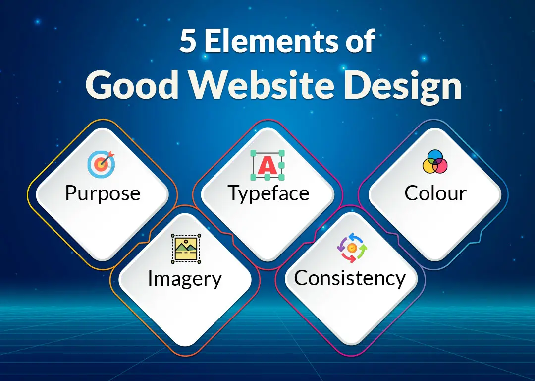
A well-designed website tends to share five qualities. The first is purpose, meaning every page exists for a clear reason. The second element of ideal web design is typeface. Typeface determines the mood and readability of your content.
The third element of ideal web design is colour. Colour can serve as a beautiful and effective medium to guide a viewer to specific areas of pages while simultaneously reinforcing the website's identity.
The fourth element of ideal web design is imagery. Imagery includes photography, illustrations, and video. Although important, they must also; (when relevant) support the verbal messages communicated visually. The fifth is imagery, including photos, illustrations, and video that support rather than distract from the message.
When all five work together, the site feels considered rather than thrown together.
What Is the 3 Second Rule for Websites?
The initial three seconds of a user's visit to a web page will determine if that user will either stay on or leave the web page you've constructed. During those initial three seconds, visitors want to know what the purpose of your website is, who should use it, and what actions should be taken once they have arrived at your website. Should they become frustrated with unclear headings, cluttered layouts or slow load times, they will leave the site with less than a 1% chance of ever returning.
Designing with the three-second rule in mind forces teams to lead with the most important message, keep above-the-fold content uncluttered, and make the next action impossible to miss.
Step 5: Choosing the Right Tech Stack
The type of interactive web application you build will be determined by the technologies, platform, and stacks you use. Given the many types of technology available, there isn't a single best stack you can use to build your application; some will be better than others for your specific application and require careful consideration of the consequences of your decisions.
Frameworks like React, Vue, and Next.js for front-end development are the most popular among developers because they make it easy to work with dynamic content on their sites. The most commonly used back-end technologies are Node.js, Python with Django and PHP with Laravel.
Content management systems Webflow, WordPress and Sanity are great options for allowing non-technical editors to update their site without needing a developer to make changes. Another popular option is to set up a headless system, where the front-end technology (how users interact with the website) is decoupled from the content layer (how the website stores its content). With this setup, teams can switch out one of the two layers (front end or back end) or both without redoing the entire site.
Front-End vs. Back-End Considerations
The front end of a website is what visitors see and touch, so smooth animations, fast page transitions, and accessible components live here. The back end handles data, authentication, and integrations with third-party services. Decisions in one area affect the other, which is why an experienced and responsive web design company usually treats both layers as a single connected system rather than two separate projects.
Picking Tools That Scale
Small businesses sometimes choose tools that fit today's needs but cannot grow with them. A site that works fine for a thousand monthly visitors may collapse under fifty thousand. Planning for tomorrow's traffic, content volume, and feature requests prevents painful migrations later.
Step 6: Developing the Interactive Features
This is where the real magic happens. Developers translate designs and prototypes into working code, weaving in the interactive elements identified during planning. Common features include animated transitions, parallax scrolling, dynamic forms, real-time search, drag-and-drop interfaces, embedded calculators, and live chat.
Each feature should be built with a purpose. Adding interactivity for its own sake slows the site down and confuses users. The best interactions feel inevitable, as if the page could not work any other way.
Animations and Micro-Interactions
Micro-interactions, which are little instances of interaction feedback, include items such as buttons that slightly bounce after they are pressed, or a heart-shaped icon that will fill with colour after it has been clicked on, and provide the user with a sense of interactivity and liveliness of the website without it being too overwhelming. There are several libraries available to assist developers in implementing these types of interactions, including Framer Motion, GSAP, and Lottie, that significantly minimize the amount of work involved with implementing these types of effects.
Interactive Elements: Forms, Chatbots, and Ideal Users
Forms are frequently overlooked as one of the most powerful forms of interactive content available. The experience of filling out a multi-step form that relies on conditional questions will feel significantly more approachable compared to a single block of questions for that same form.
There are many instances when chatbots can effectively assist visitors with common questions and navigation issues after being well thought out; yet, many will find them to be "too forward" or annoying in how they are used. The use of personalization, such as displaying unique hero images for new versus repeat customers, will result in a more customized (curated) visitor experience versus one that is generic.
Step 7: Making the Site Responsive
Mobile traffic now accounts for the majority of web visits in most industries. A site that looks great on a desktop but breaks on a phone loses a huge slice of its audience instantly. Responsive design means the layout adapts gracefully to any screen, from a wide monitor to a folding handset.
Building responsively involves flexible grids, scalable images, and breakpoints that adjust elements at specific widths. Testing on real devices, not just browser simulators, catches the awkward edge cases that automated tools miss. A reputable responsive web design company will run tests across dozens of devices and browser combinations before signing off on a build.
Touch-Friendly Interaction Design
Interactive elements designed for a mouse often fail on touchscreens. Hover effects disappear, tiny buttons become hard to tap, and dropdown menus turn frustrating. Designing for touch means larger tap targets, clear visual feedback, and gestures that match what users already know from popular apps.
Step 8: Testing & Quality Assurance
No website is ready for launch until it has been thoroughly tested and passed multiple testing levels. Functional testing checks that every button, form, and link does what it should. Usability testing puts real people in front of the site and watches how they behave, often revealing issues the internal team had stopped noticing.
Performance testing measures load times under various conditions, including slow mobile networks and older devices. Security testing looks for vulnerabilities before attackers do, covering common threats such as cross-site scripting, SQL injection, and weak authentication.
Cross-browser testing is another step that often gets rushed. A site that works perfectly in Chrome may behave oddly in Safari or break in older versions of Firefox.
Accessibility testing deserves its own mention. A site that excludes people with visual, auditory, or motor impairments not only loses customers but may also fall foul of legal requirements. Adhering to WCAG (Web Content Accessibility Guidelines) from the start is far easier than retrofitting later.
What Are the 6 Criteria for Websites?
When judging the overall quality of a site, six criteria tend to come up repeatedly:
- Usability — Covers how easy the site is to use, with clear menus, predictable layouts, and obvious next steps.
- Content quality — Looks at whether the information is accurate, fresh, and worth reading for the intended audience.
- Visual design — Considers how appealing and on-brand the look is, including typography, colour, and imagery.
- Performance — Measures load speed, stability, and how the site behaves under heavy traffic or on slower connections.
- Accessibility — Checks that everyone, regardless of ability, can use the site comfortably across assistive technologies.
- Search engine visibility — Tracks how well the site is structured for discovery through Google and other search engines.
Step 9: Launch and Post-Launch Optimization
Launch day is exciting, but it is not the finish line. The real work begins once visitors start arriving and behaving in ways the team did not predict. Analytics tools such as Google Analytics 4, Hotjar, and Microsoft Clarity reveal what is working and what needs attention.
A/B testing helps refine specific elements over time. Should the call-to-action button be green or orange? Does a longer headline convert better than a shorter one? Small experiments can add up to significant gains. Many providers of website design and development services bake ongoing optimization into their contracts because they know the first version of any site is rarely the best.
Monitoring Performance and Engagement
Key metrics to watch include bounce rate, average session duration, conversion rate, and pages per visit. Sudden changes often point to a problem, whether it is a broken link, a slow third-party script, or a confusing redesign. Regular monitoring catches these issues before they hurt the bottom line.
Iterating Based on Real User Behaviour
Heatmaps and session recordings show exactly where users click, scroll, and abandon. This qualitative data complements the numbers and often surprises even experienced designers. A button no one sees, a form field everyone skips, a section that drives the most engagement; these insights guide the next round of improvements and keep the site evolving with its audience.
Step 10: Maintenance and Long-Term Growth
A website is never truly finished. Software updates, security patches, content refreshes, and new feature requests keep it alive and relevant. Neglecting maintenance leads to broken plugins, outdated information, and security holes that can damage both your business’s reputation and search rankings.
A solid maintenance plan covers regular backups, performance audits, content updates, and periodic redesigns of underperforming sections. Working with a custom website development service that offers ongoing support means issues get caught early and improvements happen continuously rather than in panicked sprints every few years.
Building an interactive website step by step is part craft, part science, and part patience. The process moves from defining a clear purpose, through careful planning and design, into development, testing, and launch. Moreover, trusted website and design development services exceed the basic offerings and continue with optimization and maintenance long after the site goes live. Every stage of your website’s creation matters, and early shortcuts tend to surface as problems later. With the right strategy, the right tools, and the right team, an interactive website becomes more than a digital storefront. It becomes the most reliable salesperson, customer service agent, and brand ambassador a business can have—working around the clock to turn strangers into supporters.
Frequently Asked Questions
1. How can I make my website interactive?
Adding interactivity starts with understanding what visitors want to do on the site. Once those goals are clear, features can be chosen to support them. Common additions include animated buttons and hover effects, multi-step forms with conditional logic, live chat or chatbot widgets, product configurators, calculators, quizzes, video backgrounds, scroll-triggered animations, and personalized content that changes based on visitor behaviour.
JavaScript libraries such as GSAP, Framer Motion, and Lottie handle most front-end animations, while platforms like Typeform, Calendly, and Intercom slot in ready-made interactive components without heavy development. The key is restraint: each feature should solve a real user problem rather than exist merely for show.
2. Can ChatGPT actually create a website?
3. How long does it take to build an interactive website?
4. How much does it cost to develop an interactive website?
5. What is the difference between a static and an interactive website?
6. Do I need to know how to code to build an interactive website?
Request a
Free Quote Today!


